
Stream a simulated run, inspect the notifications it would send on Slack and email, and see exactly where it sits in the 7-stage PM OS flow. No password required.
The Agent Sandbox (PM Version) on falkster.com is the public, sanitized version of the agent management system I actually built and run to develop falkster.ai.
The real one runs against real data, real LLMs, real customer signal. It's how I run product on a healthcare AI company today. The sandbox is the same architecture, the same view structure, the same workflow shapes, but with the live data swapped for a scripted week of activity from a fictional healthcare SaaS, so the whole thing loads instantly and behaves the same way every time you demo it.
I'm publishing it for two reasons.
One. Most of the questions I get about AI-native product orgs are about shape, not implementation. "Where do the agents sit in the org?" "What does a PM's morning look like?" "How do I explain this to my CFO?" The sandbox is my answer that takes twelve minutes instead of twelve weeks. You see the views, you click the agents, you walk the workflows, you walk away with a follow-up question that's actually scoped.
Two. The architecture is more valuable shared than hoarded. The seven-stage PM Operating System, the agent runScript format (think → tool → output → alert), the workflow DAG shape, the Impact view that connects fleet activity to dollars, all of it works because it's been pressure-tested against a real org. Anyone running product in 2026 should be thinking in this shape. The sandbox is my opinionated take on what that shape looks like in production.
This post is the manual. Every view, every panel, every interaction. If you've clicked around the sandbox once and want to know what you missed, this is for you. If you haven't opened it yet, open it now and read this with the tab open.
The short version
The sandbox has nine views, accessed from the top navigation: Overview, PM View, Agents, Layers, Sources, Workflows, Impact, Inbox, and an Ask Falkster chat overlay. The Overview is where the demo starts. The PM View is the most personally useful. The Layers view is where you stop talking about agents as a list and start talking about how the fleet thinks. The Workflows view is the one that changes minds. The Impact view is the one that closes board members.
Every agent run is a streaming sequence of think → tool → output → alert lines, color-coded so you can see what the agent is doing at each step. Click any artifact mentioned in a run (a prototype URL, a Linear ticket, a PR) to open a full preview modal of that artifact.
The Layers view adds a second mode of observation: instead of watching one agent run, you pick a question in the Brain Console and watch the entire fleet light up step by step, sources queried, memory recalled, skills run, agents fired, decision reached. Same architecture, different lens.
You don't need a login. Nothing is recorded. Refreshing resets to the same scripted dataset every time.
The seven-stage idea-to-outcome pipeline
Before the views, the spine. Every agent in the sandbox sits in one of seven stages of an end-to-end product loop:
- Sense, Listen, watch, catch signals before they become noise.
- Discover, Turn signal into insight. Cluster, interview, synthesize.
- Decide, Prioritize. Test assumptions. Pick what moves next.
- Build, Spec, story, debt. Ship the right thing the right way.
- Ship, Gates, comms, commitments. Release cleanly, every time.
- Measure, Outcome tracking. Did we move the needle?
- Amplify, Broadcast learning. Tell the right story to the right room.
This is the PM Operating System the rest of the site is built around. Every agent is tagged with one stage. Every workflow connects agents across stages. The Overview heatmap renders the fleet rolled up by stage.
If you read nothing else from this post, internalize the seven stages. Everything else maps back.
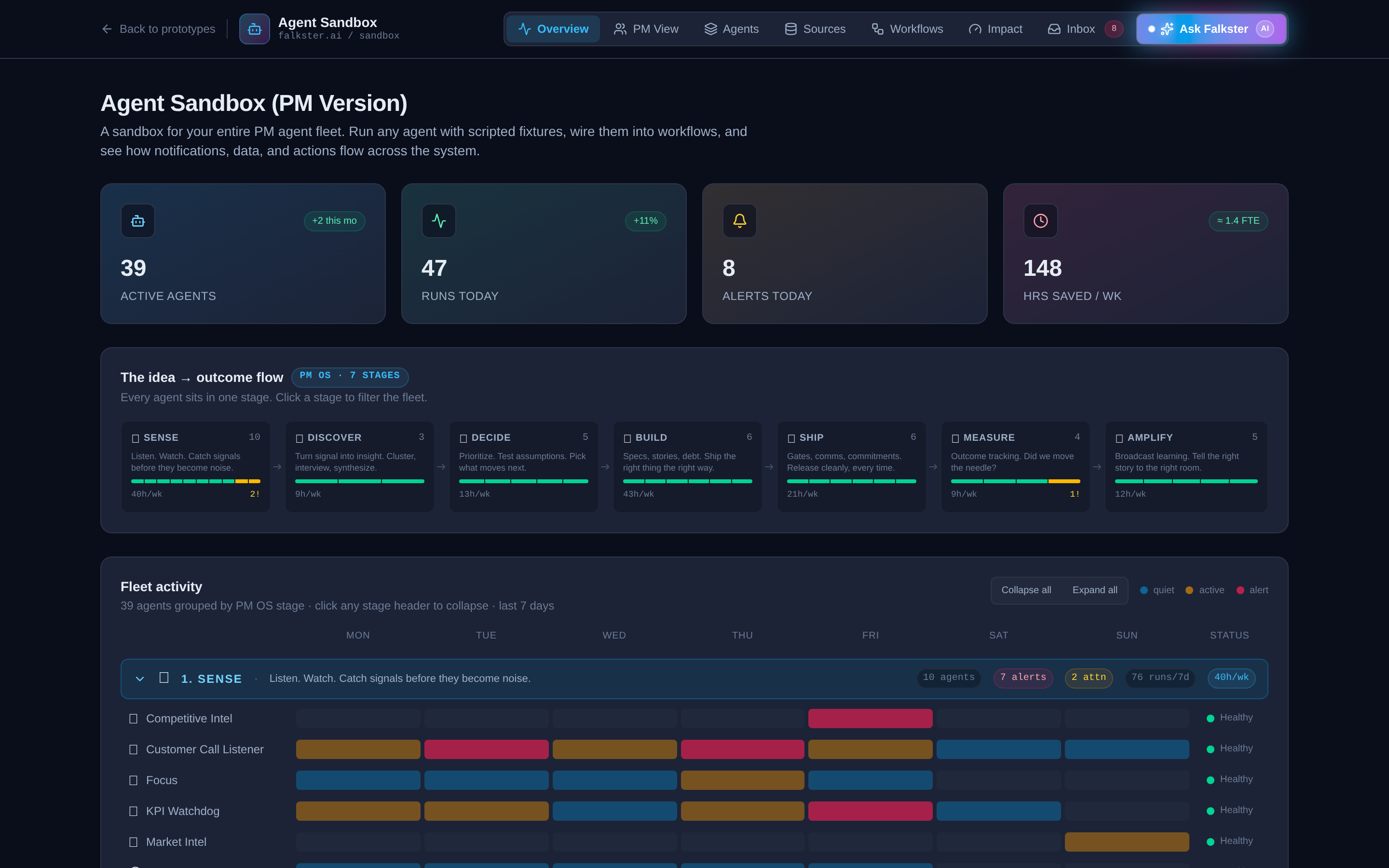
View 1: Overview, the fleet at a glance
The landing view. Four panels stacked top to bottom.
The KPI strip. Four tiles: Active Agents, Runs Today, Alerts Today, Hours Saved per Week. The "+2 this mo" badge on Active Agents is a small detail I love, it makes the fleet feel alive, like a roster that's growing. The "1.4 FTE" equivalence on hours saved is the number every CFO actually cares about. If you're showing this to finance, lead with that tile.
The idea → outcome flow. Seven stage cards laid out left to right with arrows between them. Each card shows the stage name, agent count, a small health bar, and the hours saved per week from that stage. The numbers are clickable, click a stage card to filter the entire fleet view below to just that stage.
The fleet heatmap. This is the panel that takes the longest to read and rewards it the most. Thirty-nine agents grouped into seven stage rows, with a 7-day activity grid (Mon through Sun) showing when each agent ran during the past week. Color coding: blue means quiet, gold means active, red means alert. The status pill on the right (Healthy / Attention) tells you which agents are misbehaving.
A few things to notice on the heatmap that won't be obvious on first read:
- Some agents run every day, others run weekly or on-trigger. Weekly Review, for example, fires on Sundays only. KPI Watchdog fires every weekday. The cadence is part of the design.
- Three agents are intentionally in Attention status. Product Health and Red Flag Detection are both flagged. This is deliberate so the demo doesn't look like a green-everywhere lie. A real fleet always has a few agents that need attention.
- Click a stage header to collapse it. Useful for narration. Open one stage at a time.
The runs over time chart. The bottom panel is a daily run count, overlaid with alert counts. Use this to show that an AI-native fleet has a heartbeat, not just a status.
View 2: PM View, the most personally useful
This is the view I use most often, because it answers the question every individual PM asks: "What did the agents do for me this week?"
Fifteen product managers, each owning one or two product areas in the fictional healthcare SaaS company. Maria Chen on the EHR. Sam Miller on Patient Portal. Priya Raghavan on Scheduling. Each PM is a card, color-coded by tone, showing four weekly KPIs: signals processed, prototypes shipped, bugfixes merged, and marketing artifacts produced.
At the top, a cross-org rollup shows the same four metrics aggregated across the entire org plus total hours saved. This is the "team output report" the head of product asks for every week.
Click any PM card to expand it. Each card has a Top Artifacts section showing 3-4 of the most interesting things the agent fleet produced for that PM this week. Each artifact is clickable and opens a preview modal: a working prototype, a PR diff, a Linear ticket, a Notion doc, or marketing copy across LinkedIn / Twitter / email / landing pages.
The toggle at the top right of the PM View switches the organizational lens from By PM (15 cards) to By Product Area (20 cards). Same data, regrouped. The product area lens is useful for portfolio reviews. The PM lens is useful for 1:1s.
View 3: Agents, the full roster, searchable
The Library. Thirty-nine agent cards, each with an emoji badge, name, one-line tagline, stage pill, status dot, two KPIs (health and efficiency), and a 7-day sparkline. The grid view is the default. Toggle to list view if you want a more scannable density.
Filtering controls at the top:
- Stage pills, click any of the seven stages to filter to that stage's agents only. Click again to clear.
- Category dropdown, orthogonal to stages. Six categories: Daily Ops, Weekly Ops, Signal, Delivery, Go-to-Market, Leadership. Pick one to filter.
- Search bar, real-time filter by agent name or tagline.
Click any agent card to open the side panel. The side panel is where the sandbox earns its name. You'll see:
- The runScript, a streaming animation of think → tool → output → alert lines, played out at staggered delays of 100-900 milliseconds each so you can read along. Orange text is "thinking" (what the agent decided to do next). Blue text is "tool" (what API or system the agent called, with a meta line showing the query and result). Green text is "output" (what the agent produced). Red text is "alert" (what the agent flagged).
- Tools, the integrations this agent uses (Slack, Gmail, Linear, GitHub, etc.).
- Triggers, what causes this agent to run. Could be a cron schedule, a Slack message pattern, a webhook, or a manual command like
/focus. - Notifies, which channels the agent posts to (Slack, Email, Dashboard, PagerDuty, Linear).
The runScript is the most copied piece of this whole sandbox. If you want to design your own agent, study three or four runScripts here and follow the same think-tool-output-alert structure. It's terse, it's debuggable, and it's the right shape for production.
View 4: Layers, the brain console
The newest view, and the one I now use first when I'm explaining how an AI-native fleet actually works. Where the other views show you what the agents do, Layers shows you how they decide.
The 4-layer hub
A central hexagonal core with four arcs of nodes radiating out, each arc a peer layer:
- Agents at the top, violet. The doers, grouped by the seven stages (Sense, Discover, Decide, Build, Ship, Measure, Amplify). Five summary nodes for the public sandbox, mapping back to the 39-agent roster.
- Skills on the right, sky. The reusable building blocks every agent calls. Tools (MCP, APIs), Prompts (system + few-shot), Models (LLMs and classifiers), Evals (specs as tests). Versioned and tuned independently of the agents that use them.
- Sources at the bottom, amber. The truth feeds. Amplitude, Slack, Zendesk, Linear, HubSpot. Each source carries a tiny throughput badge underneath its label (
48k/d,1.2k/d,3.4k/d, etc) so you can see at a glance which feeds dominate. - Memory on the left, emerald. Everything that survives between runs. Episodic (what happened), Semantic (what's true), Procedural (what works). A toggle below switches the framing to access scope (Personal, Team, Global). Same memory, different cut.
Node size encodes scale and impact. The Models node is the biggest sky ball because every run touches it. Amplitude is the biggest source because it fires 48k events a day. Semantic memory is the biggest emerald node because it's the permanent store. Evals, HubSpot, and Procedural memory are the smallest because they're specialized and small-volume. Spoke thickness scales with the same weight, so heavier nodes pull a visibly thicker line into the hub.
Above the diagram, four KPI tiles: 39 agents · 4 skills · 5 sources · 3 memory tiers. Click any tile to filter the hub to that layer (the others dim, the spokes fade out). A slow rotating soft-pink scan beam sweeps around the hub at about 22 seconds per revolution. Faint orbit rings show the four "rails" the nodes ride on. The whole thing has a 4-second drop-shadow pulse that breathes between violet and pink.
The Brain Console
Below the hub, six pre-built questions a PM would actually ask the fleet. Click one and the hub lights up step by step:
- Is Mercy Hospital about to churn? Pulls Amplitude activity (down 47% in 30 days), Zendesk tickets (3 open P1s), HubSpot CSM notes ("renewal Q3, soft signals"), Slack channel chatter (champion on parental leave). Recalls episodic memory of the last QBR ("considering Epic"), semantic ICP ("mid-market hospital, 200 to 400 beds"), and the procedural save-account playbook (used 14 times this year, 62% save rate). Runs the churn-risk classifier and a retention email drafter. Fires the Sense and Decide agents, files a Linear ticket, pings the CSM. Decision: RED FLAG, 79% confidence, $340K ARR at stake.
- Should we ship bulk-reassign this sprint? Linear + Slack + Amplitude → 5 of 5 recent interviews validate the pain → semantic fact "82% of users are multi-provider clinics" → impact estimator and eval suite (21 of 23 fixtures pass) → Discover (assumption-tester) and Decide (RICE rank). Decision: SHIP IT, 84%, slot for May 11.
- Are there P0 bugs we missed in Patient Portal? Clusters tickets across Zendesk, Slack mentions, and Amplitude error-event spikes. Surfaces a Safari-only PHI rendering bug affecting 9 customers. Decision: P0 ticket opened, hot-fix branch, compliance notified.
- Are clinicians asking for the same EHR thing 3+ times? Clusters across all three input sources, applies the 3-customer threshold from procedural memory, promotes 4 themes to the opportunity tree.
- What did we ship this week worth amplifying? Pulls merged Linear issues, applies a "newsworthy" definition from semantic memory, drafts the all-hands recap from a procedural template, opens it in Notion for review.
- What experiment should we run on Patient Portal next? Funnel breakdown identifies the −38pp click drop at email-invite, generates 5 subject and body variants, runs pre-launch evals, schedules the test for Monday.
Each scenario is 8 to 13 trace steps, animated at about 800ms per step. The hub diagram glows the corresponding node, the timeline below highlights the active step, and a pink path traces between consecutive nodes with a flowing dashed line. At the end the decision card unlocks: a confidence ring (color-shifted at the 70 and 85 thresholds), a one-line headline, the why, the recommended next actions, and a dollar or hours-saved impact estimate.
Play, Pause, Reset, and click-any-step controls. Or just click the dots in the timeline to scrub.
The entity browser
Below the console, a search-filterable list of every customer and every product area the brain reasons over. Six fictional healthcare-SaaS customers (Mercy Hospital, Cedar Pediatrics, Mountain View Medical, Riverside Family Health, Northgate Specialty, Bayview Urgent Care) with health badges (red, yellow, green), ARR, contract end, CSM, product mix, and the recent signals each data source has on them ("daily logins down 47%", "3 open P1 tickets", "champion on parental leave", etc).
Toggle to Products and you get all 20 product areas with their weekly stats (signals, prototypes, bugfixes, marketing, hours saved) and top artifacts. Selecting a scenario auto-selects its anchor entity. Selecting an entity gives you the raw memory and recent signals the brain would pull if you asked any question about it.
This is the answer to "but what if I want to know what the brain knows about Customer X?" Open the entity browser. Click them. Read the four signal cards. That's exactly what the agent would have in context on its next run.
The memory deep-dive
Below the entity browser, memory described two ways with a toggle:
- By tier (cognitive). Episodic, Semantic, Procedural. The canonical agent-engineering cut.
- By scope (access). Personal, Team, Global. The canonical org cut.
Each bucket has a one-liner, three concrete examples, lifecycle (when written, TTL, who can correct), the owner, and a rose "if absent" failure mode. Toggling the framing also switches which 3 memory nodes appear in the hub above, so you can see both lenses against the same architecture.
Below that, the five-step run loop, Trigger → Hydrate → Reason → Act → Persist, color-coded by which layer each step touches, with the annotation that steps 02 (Hydrate) and 05 (Persist) are the only ones where memory lives. The rest is stateless. That single sentence has changed more conversations about agent architecture for me than any 50-slide deck.
This is the view I now send to anyone who asks "but how do agents actually decide things?" One Brain Console scenario walks through the answer better than an hour of explanation.
View 5: Sources, the data plumbing
This is the view nobody asks for and everybody needs. Thirty-eight data sources organized into eight categories: Product Analytics, Revenue & Billing, Customer Intelligence, Engineering, Internal, Research, Browser, Local Corpus.
Each source card shows its kind (SaaS, Code, Internal, Research, Browser, Local, Corpus), health status (healthy / degraded / failing / not-connected), signals per day, last sync time, latency, and the list of agents that consume it. Hover the volume sparkline to see the 7-day trend.
The point of this view is that you cannot have a 39-agent fleet without a serious data platform underneath. The "Used by" list on each source card is the hidden architecture. Amplitude is consumed by Product Dashboard, Red Flag Detection, and Weekly Ops Digest. GitHub is consumed by Auto Bugfix, PRD Generator, and Release Readiness. If a source goes degraded, every agent downstream is affected.
If you want to argue with your CTO about how much to invest in data plumbing, open this view first.
View 6: Workflows, the DAG view
Three workflows, each a directed acyclic graph (DAG) connecting agents into a multi-step pipeline.
Morning Brief (5 agents, 5 runs/wk, 8.4 hours saved/wk). Fires at 06:00 UTC daily. Product Dashboard runs first. If it detects an anomaly, it triggers Red Flag Detection, which runs PM Issues. Focus runs last and produces the day's first Slack message for each PM.
Release Pipeline (4 agents, 4 runs/wk, 3.7 hours saved/wk). Fires when a GitHub release candidate is created. Release Readiness runs the eval suite. If 8 out of 8 evals pass, Release Checker greenlights the deploy. If a regression is detected post-ship, both Product Health and PM Issues fire in parallel.
Ten-Day Loop (5 agents, 8 runs/wk, 41.7 hours saved/wk, the highest-value workflow in the sandbox). Fires when a customer request lands in Slack, Zendesk, Gong, or Salesforce. Instant Prototype builds a clickable demo within minutes. If the customer accepts, PRD Generator and Auto Bugfix run in parallel. Release Readiness gates the deploy. Launch Comms fires the announcement.
The workflows view doesn't have many interactive controls, it's the most visualization-heavy view. But that's its power. Walk through the Ten-Day Loop on a board call, and you've explained the entire AI-native shipping cadence in 90 seconds.
View 7: Impact, the CFO view
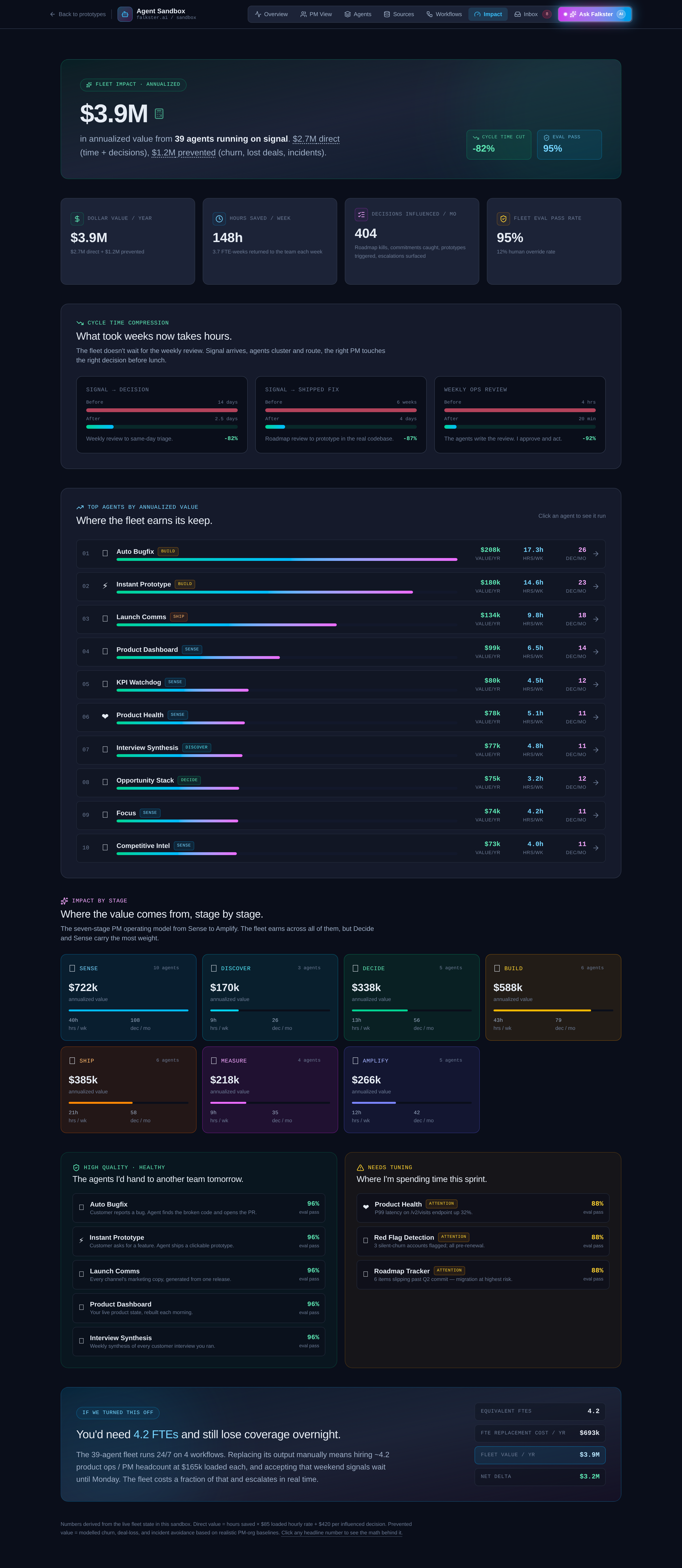
The view that closes board members.
 Seven metric tiles, each clickable to open a detailed drill-in modal:
- Total impact per year (the headline)
- Direct dollars (revenue captured by the agent fleet)
- Prevented losses (revenue protected by catching things early)
- Decisions per month (how many bets the org made)
- Eval pass rate (the quality bar)
- Cycle time, signal → decision
- Cycle time, signal → shipped
- Cycle time, weekly ops
Click any tile to see the per-stage breakdown. Click a stage to see the per-agent contribution. The drill-in modals are where the math lives. If you're going to argue this with your CFO, you need to be able to defend each number in the chain.
A note on the dollar amounts: they're calibrated for a fictional healthcare SaaS at roughly $50M ARR. Don't quote them to your team. The mechanics matter, the numbers don't.
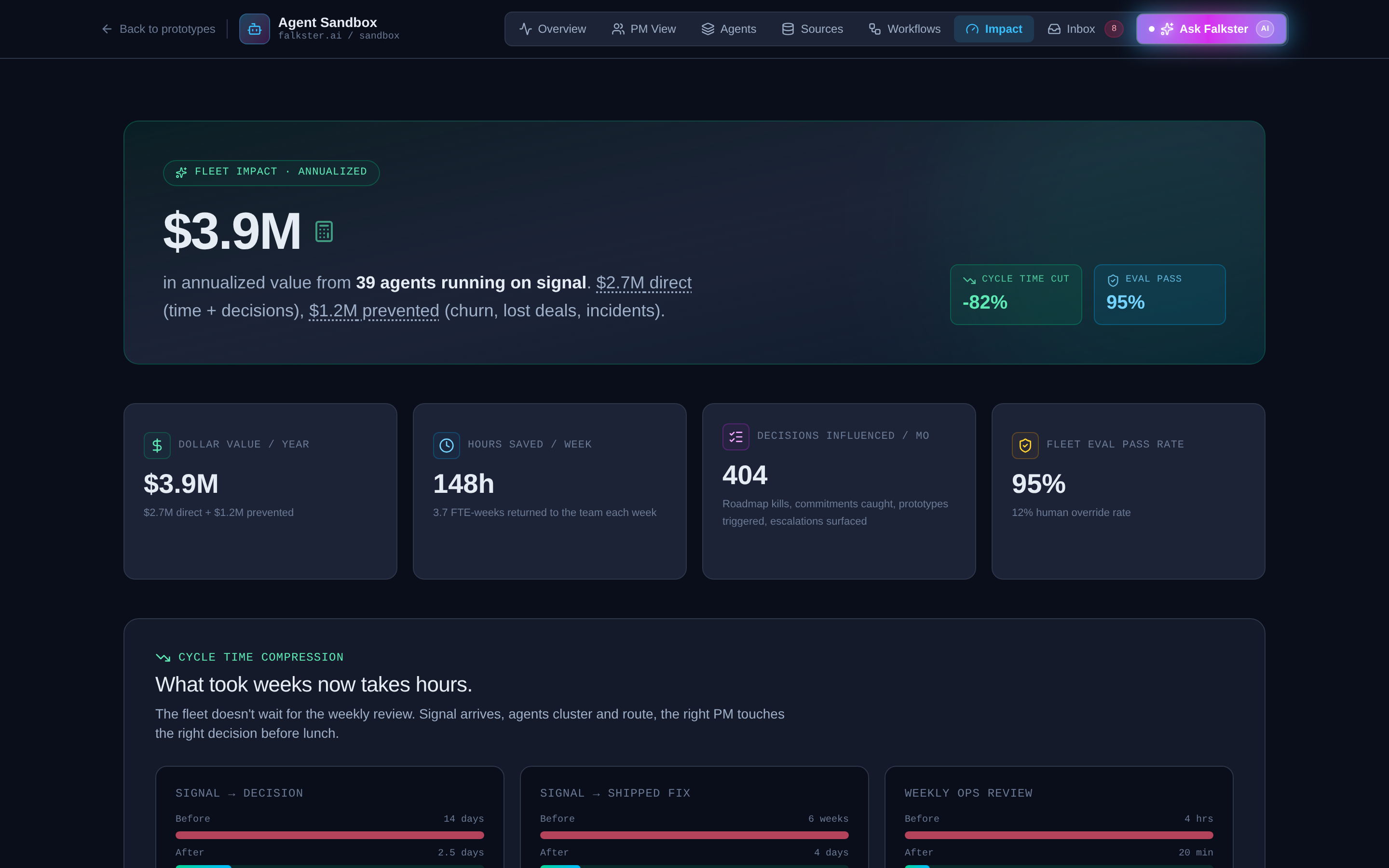
View 8: Inbox, every notification, by channel
Every notification the agent fleet generated this week, in one stream. Severity pills (INFO, WARN, CRIT). Channel icons (Slack hash, Mail, Dashboard gauge, PagerDuty bell, Linear checklist). Click any notification to expand its detail.
Two pie charts at the top break down the mix: one shows channel distribution (how much of the week's noise went to Slack vs Email vs PagerDuty), the other shows severity split (how much was INFO vs WARN vs CRIT).
The inbox is the view you check when you're trying to debug "why did my morning Slack get so noisy this week." A real fleet generates a lot of notifications. The mix charts tell you whether the channel routing is working, too much in PagerDuty means the eval thresholds are too tight, too much in Email means nobody's reading.
View 9: Ask Falkster, the chat overlay
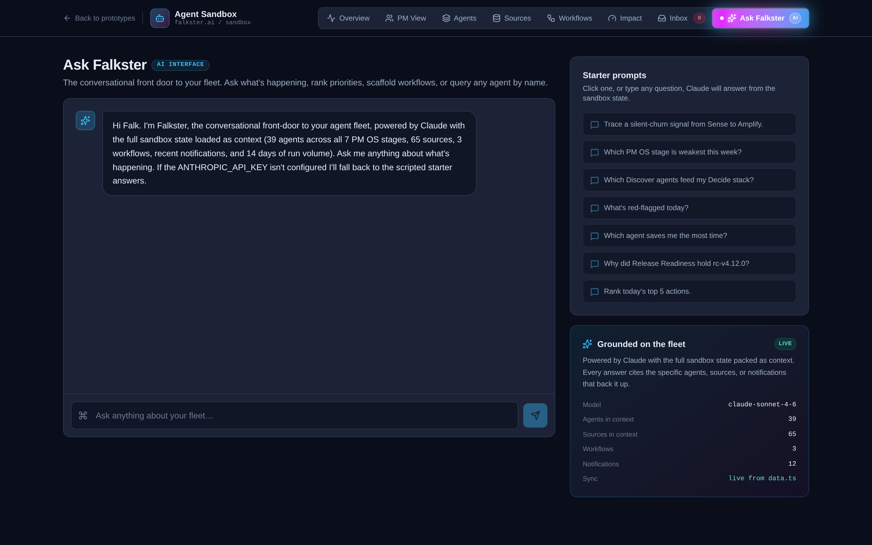
A conversational frame around the agent runScript. Four starter prompts at the bottom (the kinds of questions a CPO would ask the fleet). Type your own, or click a starter. The response is templated against a small set of pre-baked answers, this is not a real LLM. It's there to demonstrate the agent's runScript format inside a chat UI, so you can see how the same think → tool → output structure works as a conversational reply, not just a scheduled job.
If you ask something off-script you'll get the default response. That's intentional. The point is the format, not the intelligence.
The clickable artifact preview
There's one cross-cutting feature that's not a view but is the most fun thing in the sandbox. Anywhere you see a clickable artifact mention, a prototype URL, a PR diff, a Linear ticket, a Notion doc, a piece of marketing copy, clicking it opens a full preview modal of that artifact. There are about 25 different artifact templates baked in. The interesting ones:
- Visit Summary, a healthcare visit summary the agent drafted from a transcript
- Refill Triage, a medication refill prioritization screen
- Lab Explainer, patient-facing lab result interpretation
- Insurance OCR, an OCR'd insurance card with structured fields
- Onboarding Wizard, a multi-step new-patient setup flow
- Bulk Reassign, an admin tool for reassigning patients between providers
These artifacts are interactive, you can click around inside them, not just look. They're what an "Instant Prototype Agent" would actually produce. Showing one to a customer in a call is a different experience than showing them a Figma.
The recommended demo path
If you're showing the sandbox to your team, walk it in this order. It takes about fifteen minutes if you don't get derailed.
- Overview (3 min). Narrate the four KPI tiles, then the heatmap. Land the "1.4 FTE saved per week" number.
- Click into one agent on the Overview heatmap (2 min). Open the side panel. Watch the runScript animate. Read one think line, one tool line, one output line out loud.
- Workflows → Ten-Day Loop (3 min). Walk through the DAG node by node. This is the moment people stop arguing about whether AI agents are real.
- Layers → pick the Mercy Hospital scenario (3 min). Let the trace play through, narrate as it goes. "Three sources query, three memory tiers recall, two skills run, two agents fire, decision lands at 79% confidence." This is the moment people stop asking "but how does it actually decide?"
- PM View (2 min). Show one PM card. Open one prototype artifact in the preview modal. Click around inside it.
- Impact (2 min). Land on the total impact tile. If anyone asks how, click a tile to drill in.
That's the demo. Skip Sources, Inbox, and Ask unless someone explicitly asks. They reward curiosity but don't carry the headline.
What the sandbox is not
A few honest caveats:
It's not connected to real data. Refresh and you get the same scripted week, every time. The sandbox is the architecture, not the implementation. The real one I run at falkster.ai is the implementation.
It doesn't run real LLMs. Every agent's runScript is hand-scripted. The "thinking" lines are pre-written. This is by design, the sandbox should load instantly and behave the same way every time you demo it. The real one calls Claude on every run.
It's not optimized for mobile. The Overview is readable on a phone. The Workflows view is unreadable. Demo on a laptop.
The Ask Falkster chat is templated. It will not answer arbitrary questions intelligently. The real one at falkster.ai is wired to Claude with retrieval over our actual data sources.
How to use it
The sandbox is meant to be used in three ways.
As a demo, internally. Walk your exec team or your product org through it on a screen share. Twelve minutes, end to end, in the order described above. This is the fastest way to align a leadership team on what an AI-native product cadence actually looks like, without anyone having to imagine it from a slide deck.
As a thinking tool, individually. Open the PM View. Mentally swap the fictional product areas for your real ones. Mentally swap the 15 PMs for your team. Now look at the four weekly output columns, signals, prototypes, bugfixes, marketing artifacts. Where would your team's numbers land today? Where would they land if you had this fleet running? That gap is what I help CPOs close.
As a scoping artifact, externally. When a CPO or founder asks me "how would I build this for my org," I send them the sandbox first. By the time we get on a call, they've clicked through every view, they know what questions to ask, and the conversation jumps straight to "what would the agent fleet look like for our specific product surface." That conversation is half the work.
If you want to build the real one for your org, reach out. I do a small number of audits and workshops a year for product orgs making this transition. The sandbox is the conversation starter, not the deliverable.
Sources: The 7-stage PM Operating System · Your AI Agent Fleet · The full agent fleet (39 blueprints) · Work with me
Also on Medium
Full archive →AI Agents and the Future of Work: A Pixar-Inspired Journey
What product managers can learn about AI agents from how Pixar runs a film team.
Many AI Agents Are Actually Workflows or Automations in Disguise
How to tell agents from workflows from cron jobs, and why it matters for what you ship.
Frequently asked
Is the Agent Sandbox a real product I can connect to my data?+
Not the sandbox itself, that is a deterministic prototype with pre-baked runs. But the architecture is the agent management system I actually built and run to develop falkster.ai. The sandbox is the public, sanitized version of that real system. If you want the real version for your org, that's a build engagement, not a download.
What is different between the sandbox and the real one you run at falkster.ai?+
Three things. The sandbox runs scripted runs, the real one calls Claude. The sandbox uses a fictional healthcare SaaS dataset, the real one runs against falkster.ai's actual support tickets, eval pipeline, GitHub repos, and CRM. The sandbox's Ask Falkster chat is templated, the real one is wired to Claude with retrieval over our data sources. Everything else, view structure, stage taxonomy, agent runScript format, workflow DAGs, Impact view math, Brain Console traces, PM rollups, is identical.
Where is the sandbox data coming from?+
Two pre-baked datasets. The fleet views (Overview, Agents, Layers, Sources, Workflows, Inbox, Impact) share one dataset. The PM View runs on a parallel slice of the same fictional week, organized by 15 product managers and 20 product areas. Everything is hand-scripted to demo cleanly and behave the same way every time.
Can I download the sandbox or get the source code?+
No. The sandbox is a hosted demo, not a deliverable. The architecture, the runScript format, the workflow DAG shape, the Impact view math, and the Brain Console scenario format are all documented across this site so you can build your own. If you want me to build it for your org, that's an audit or workshop engagement.
Why are some agents marked Attention or Failing?+
Three of the 39 agents intentionally have non-healthy statuses so the heatmap and KPI strip show what a real fleet feels like. Healthy is boring. The interesting question is which agents to leave on attention vs which to pause.
What is the difference between a stage and a category?+
A stage is where the agent fits in the seven-stage idea-to-outcome pipeline (Sense, Discover, Decide, Build, Ship, Measure, Amplify). A category is how the agent runs (Daily Ops, Weekly Ops, Signal, Delivery, Go-to-Market, Leadership). Same agent, two organizing axes. Stages live on the Overview heatmap. Categories live on the Agents view filter.
What is the Layers view and how is it different from Workflows?+
Workflows shows DAGs of agents wired into pipelines, what runs after what. Layers shows the architecture underneath: four peer layers (Agents, Skills, Sources, Memory) and how a single decision flows across them. Pick a question in the Brain Console and the hub animates which sources are queried, which memory is recalled, which skills run, which agents fire, in what order. Workflows is about pipelines. Layers is about cognition.
How does the Brain Console actually work, is it thinking?+
It's a deterministic trace, like every run in the sandbox. Each of the six scenarios has a hand-scripted ordered list of 8 to 13 steps that touch a specific source, memory tier, skill, or agent node. The animation steps through them at about 800ms cadence and the hub diagram lights up the corresponding node. The decision card and confidence score are pre-computed too. The point is to make agent cognition visible, not to demonstrate live LLM reasoning.
How do I demo this to my team?+
Open the Overview, narrate the heatmap. Click into one agent to show the streaming run. Switch to Workflows and walk through the Ten-Day Loop. Open the Layers tab and play one Brain Console scenario end to end. Close on the Impact view. Fifteen minutes total. The order is built for that demo path.
Is the Ask Falkster chat actually AI?+
No. The chat overlay is a deterministic responder that pattern-matches your question against a small set of starter prompts. It is there to demonstrate the agent runScript format inside a conversational frame, not to answer arbitrary questions. If you ask something off-script, you'll get the default response.

Comments (0)
Sign in with LinkedIn to leave a comment.
Sign in with LinkedIn